Flipside Mini Donuts
CAFE & BAR
BRANDING | 2019
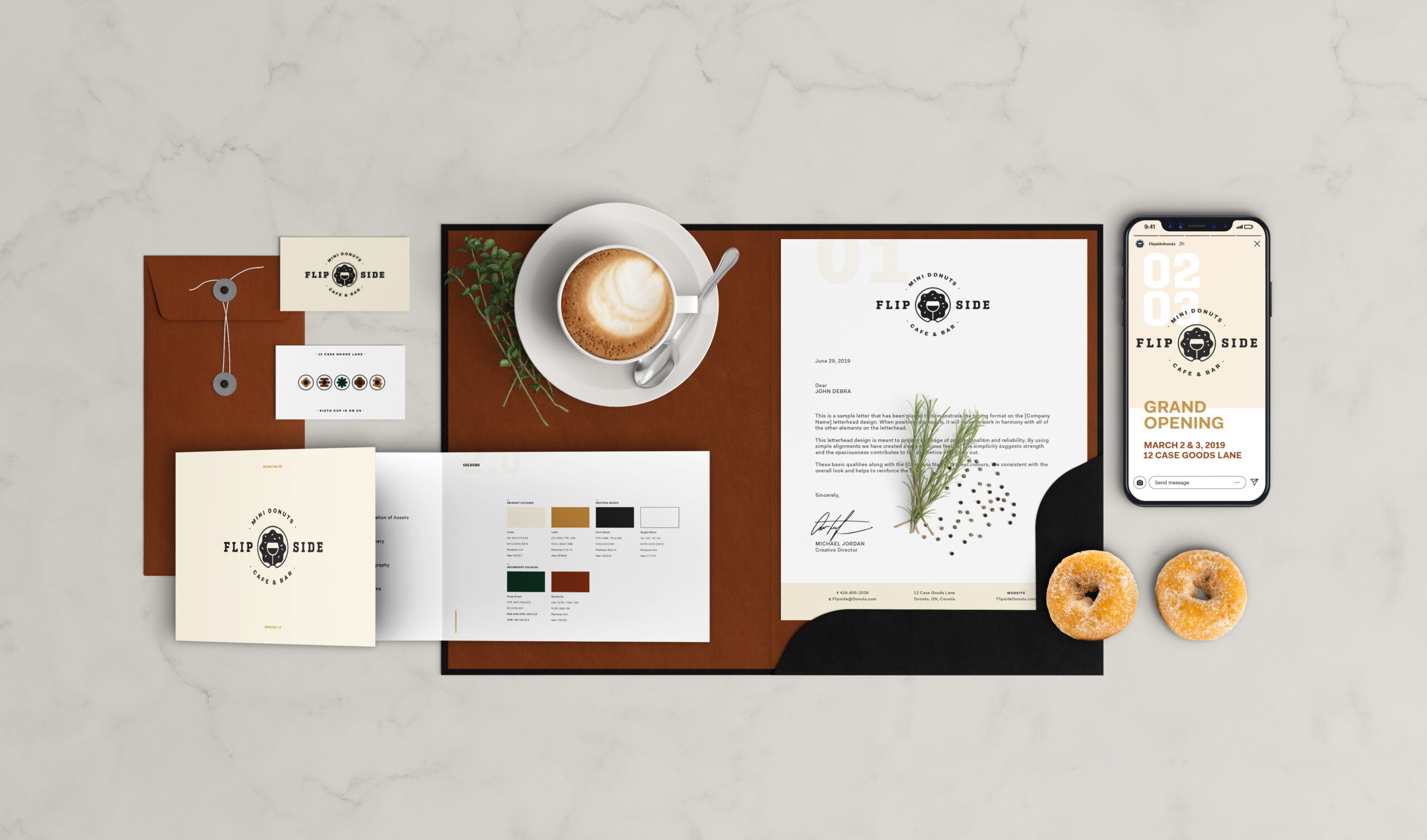
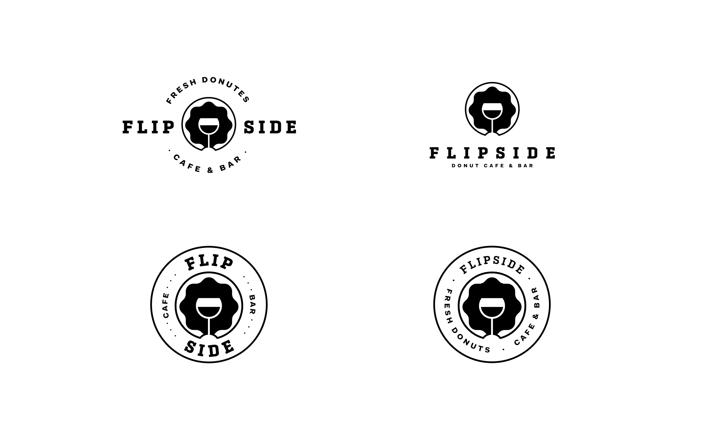
The client’s vision was to create a café–bar hybrid in Toronto’s Distillery District, centered around fast, fresh mini donuts that are made to order. The client requested a visual fusion of alcohol and donuts, supported by a refined colour palette that featured a deep green.
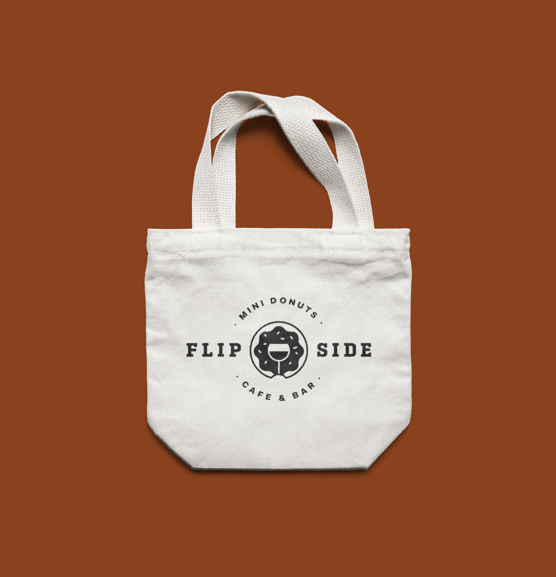
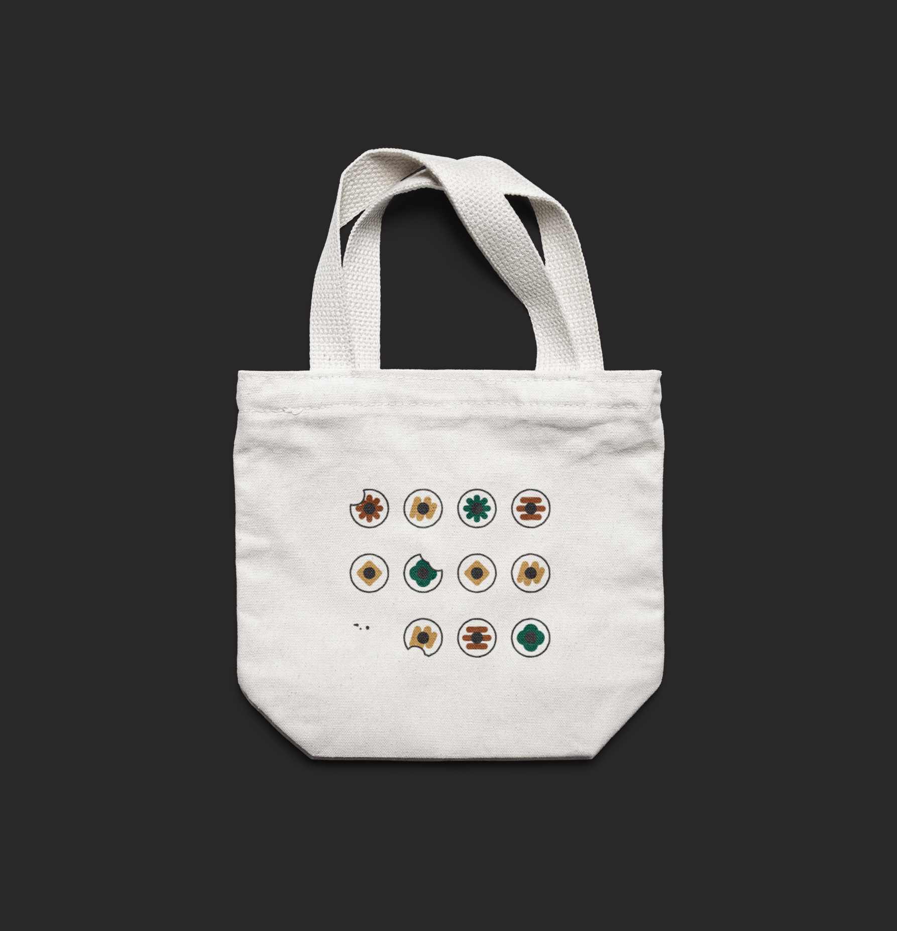
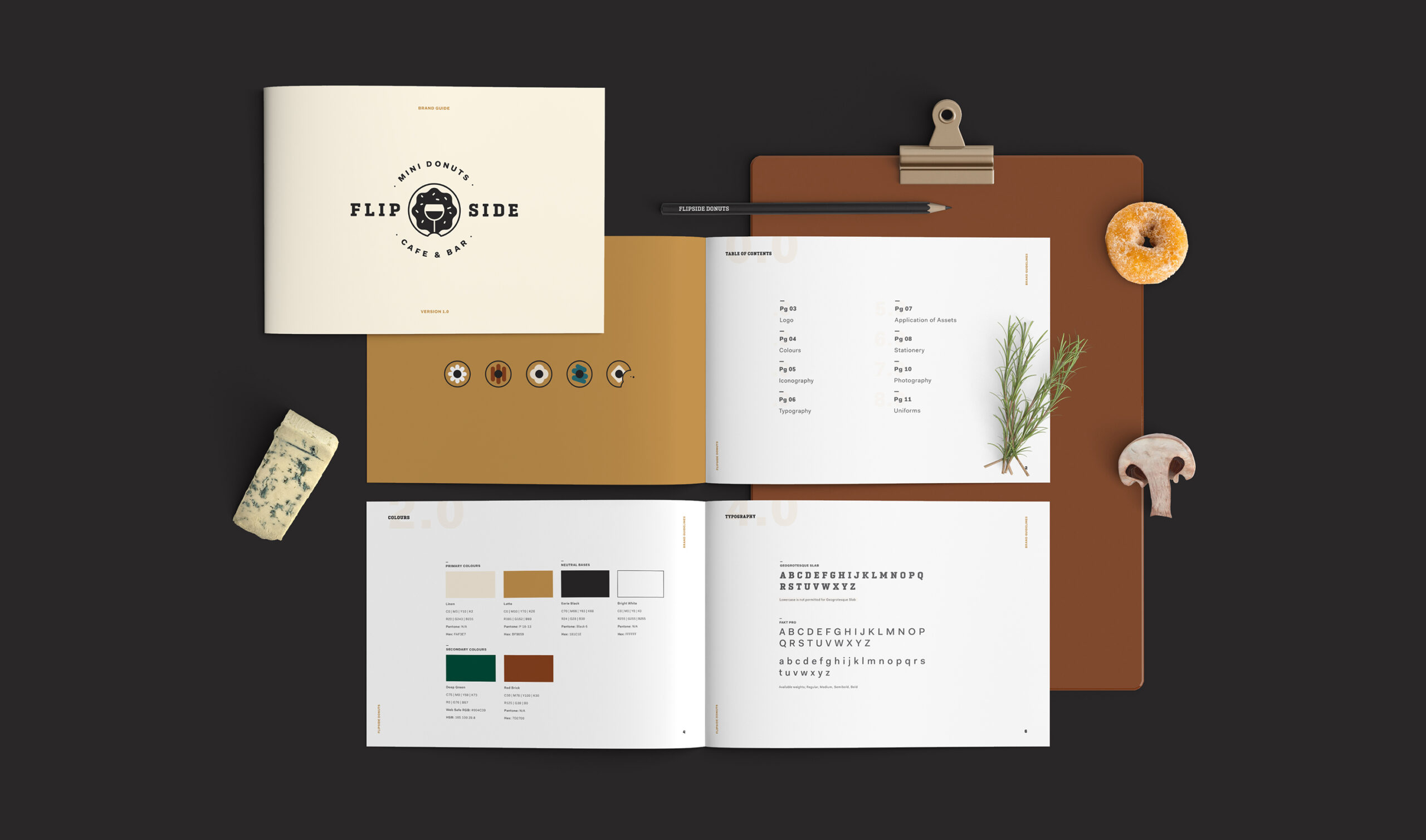
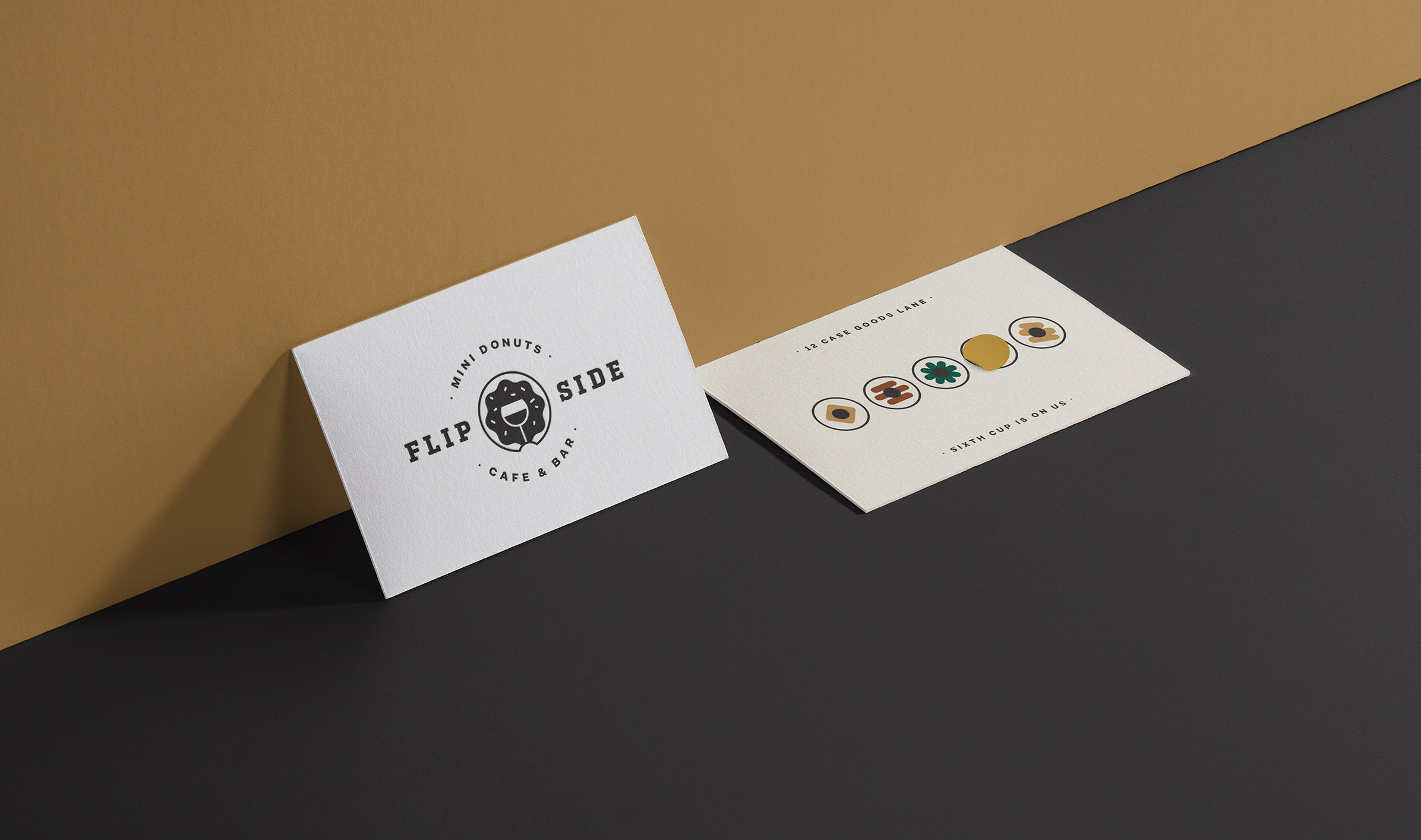
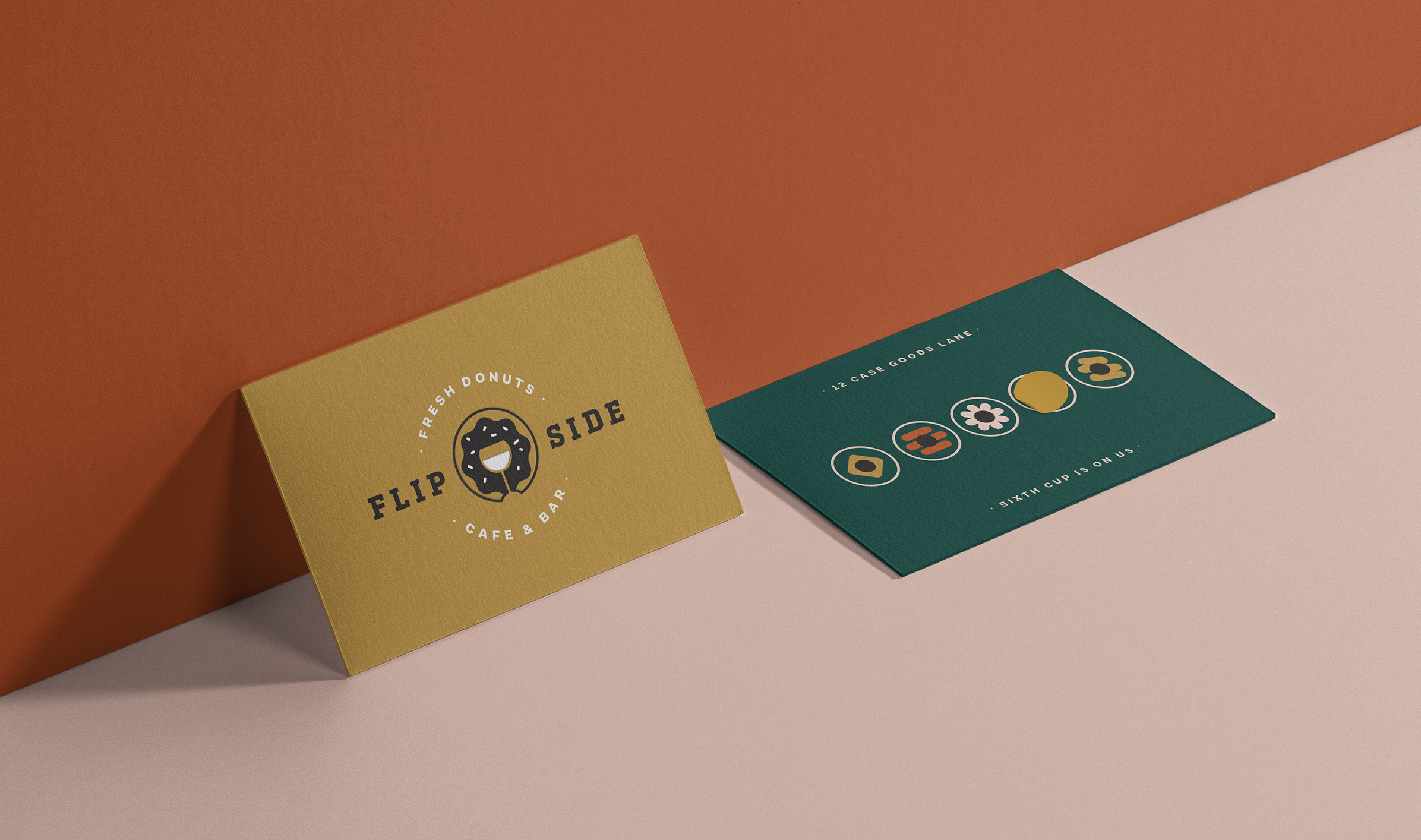
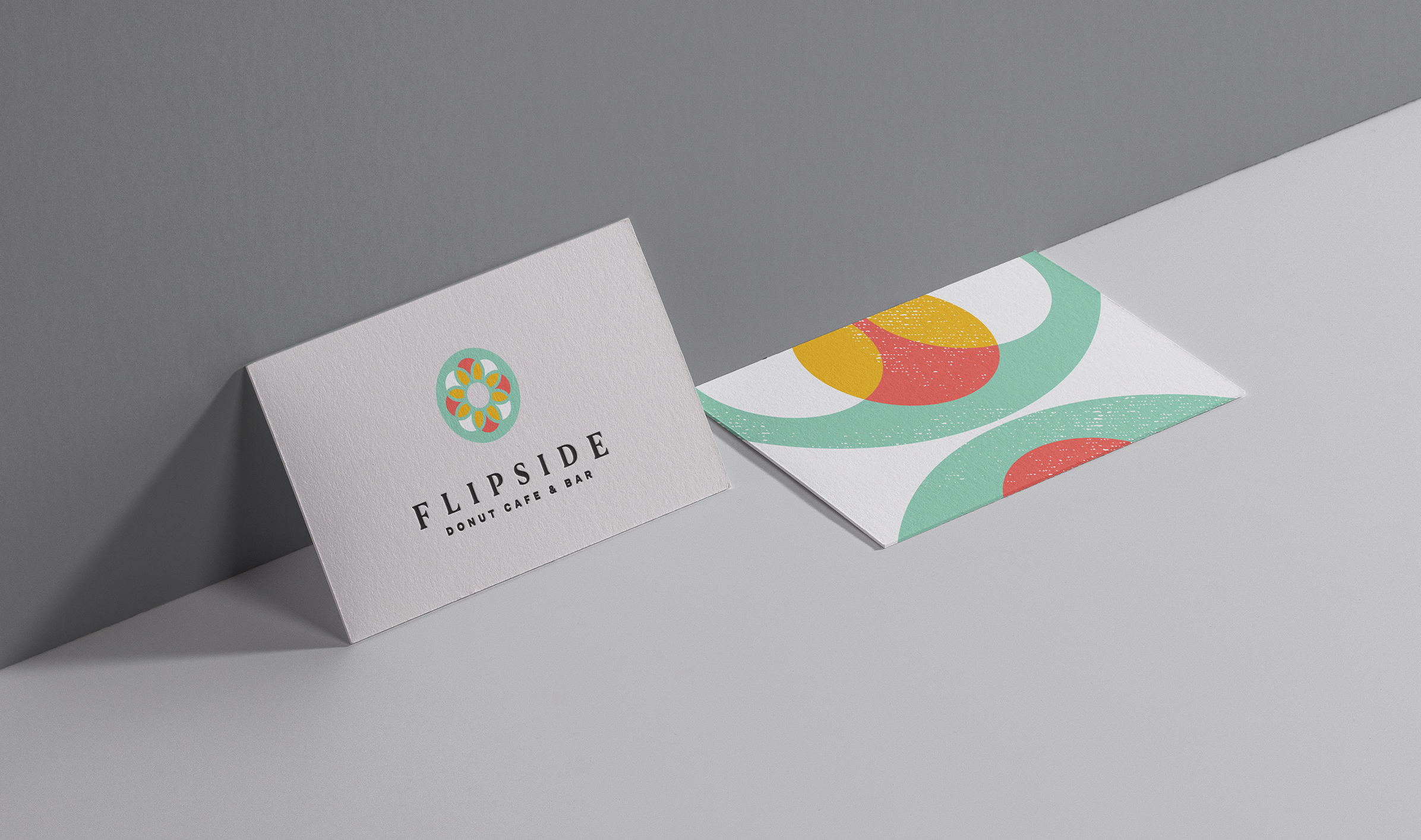
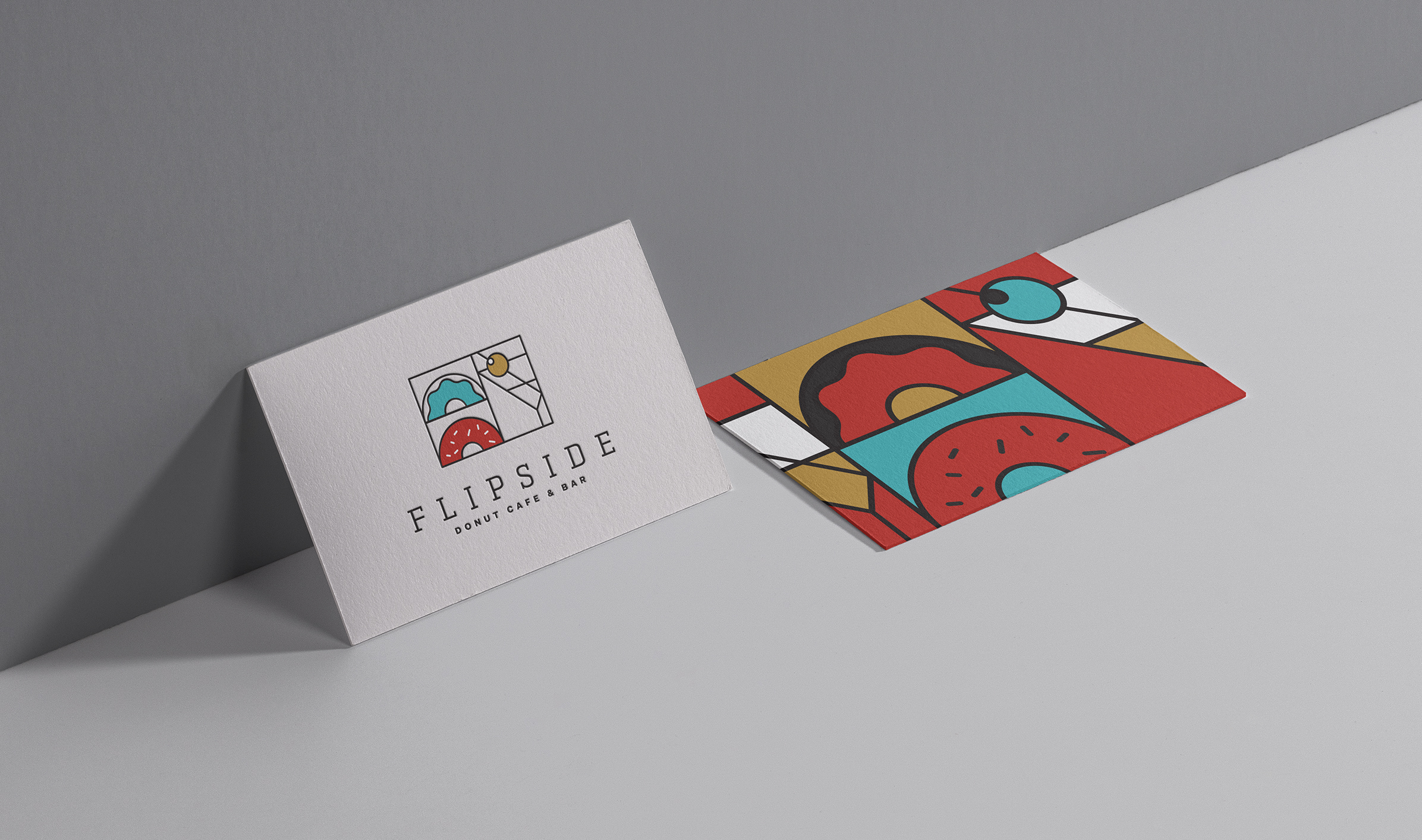
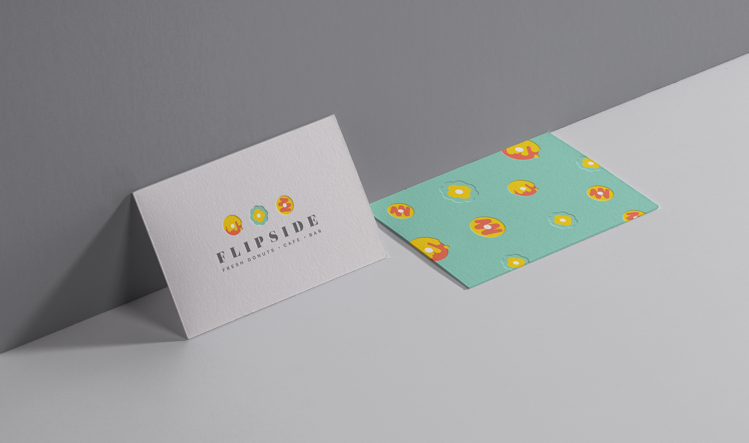
For the logo mark, I designed a donut that reveals a wine glass through negative space, with the stem doubling as a bite. To support brand expansion, I developed a series of abstract icons representing each donut flavour. These icons were extended into a repeat pattern and applied across merchandise.
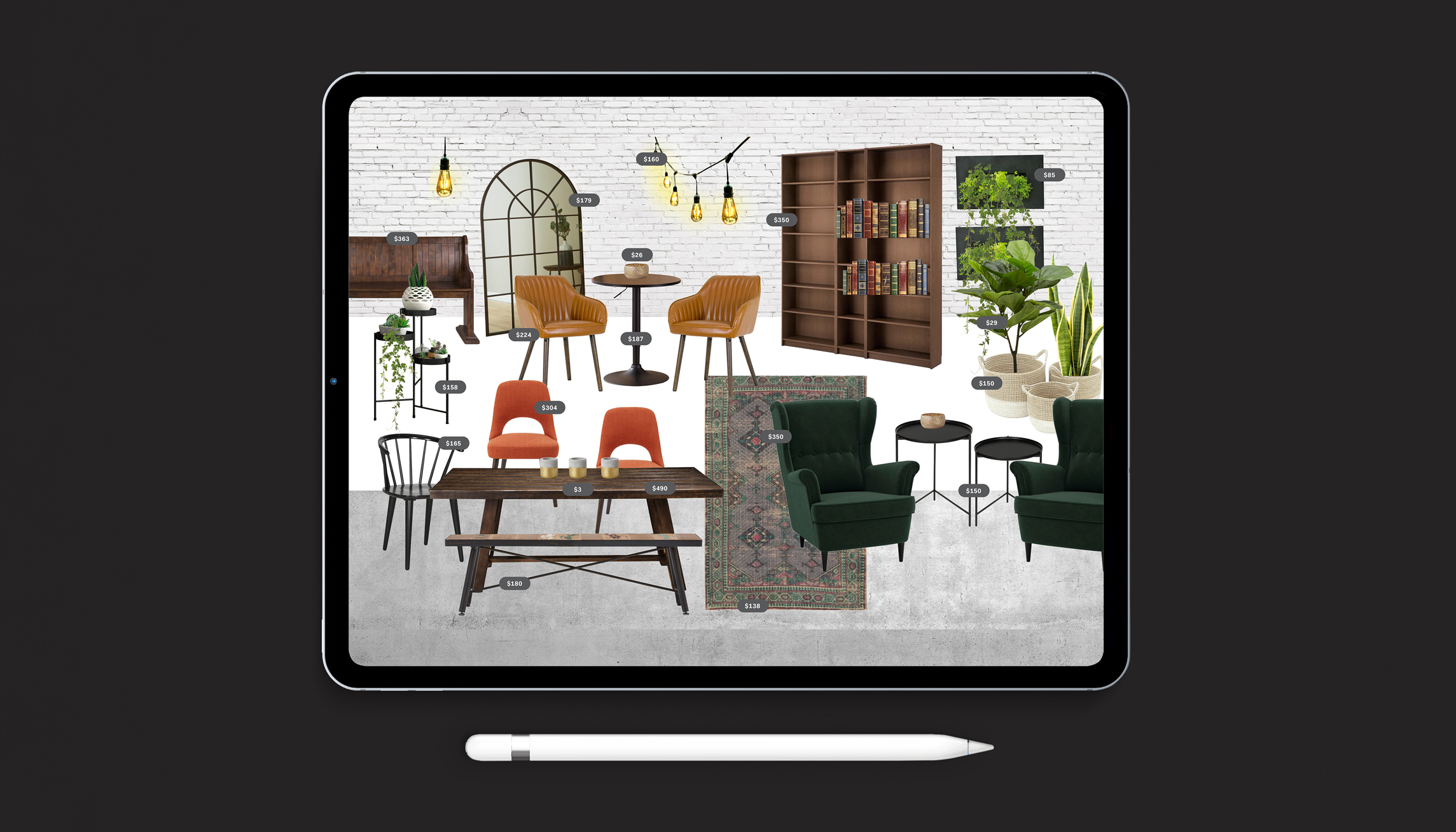
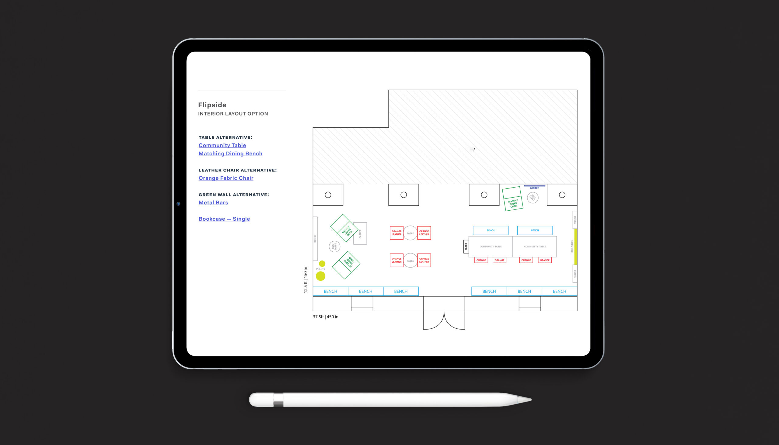
In addition to the brand identity, I contributed to the interior design, ensuring the physical space reflected the brand’s tone and personality. The concept blends industrial elements with the warmth of a library. Soft, breathy pink accents offset deep forest greens, browned-butter golds, and toasty ambers. Cozy, tucked-away seating nooks with overstuffed chairs invite guests to linger—creating an intimate, indulgent setting to unwind with wine and donuts.