Robin Hood
CANADIAN STAGE PANTO
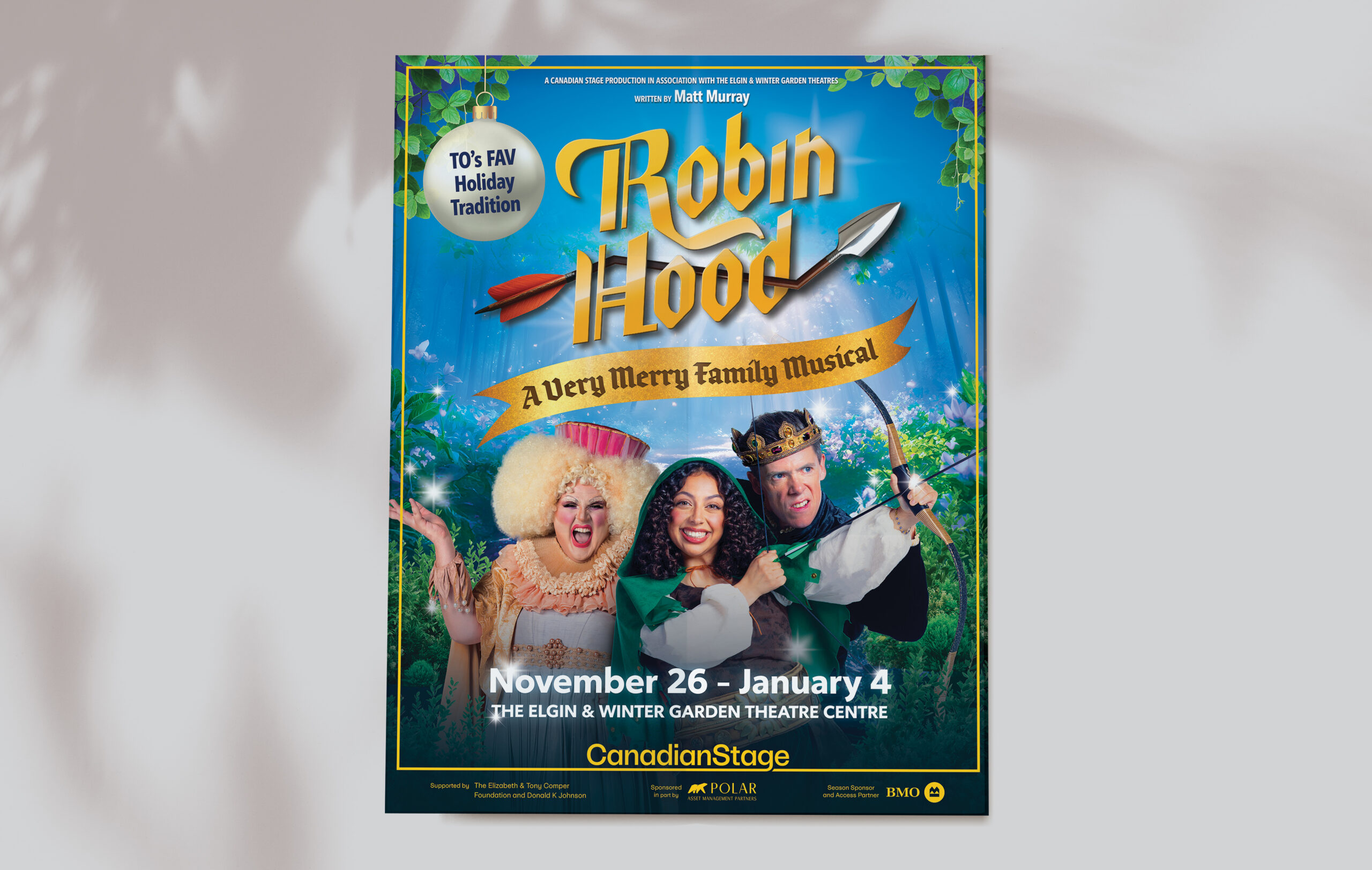
PHOTO ILLUSTRATION, BRANDING, PRODUCTION | 2025
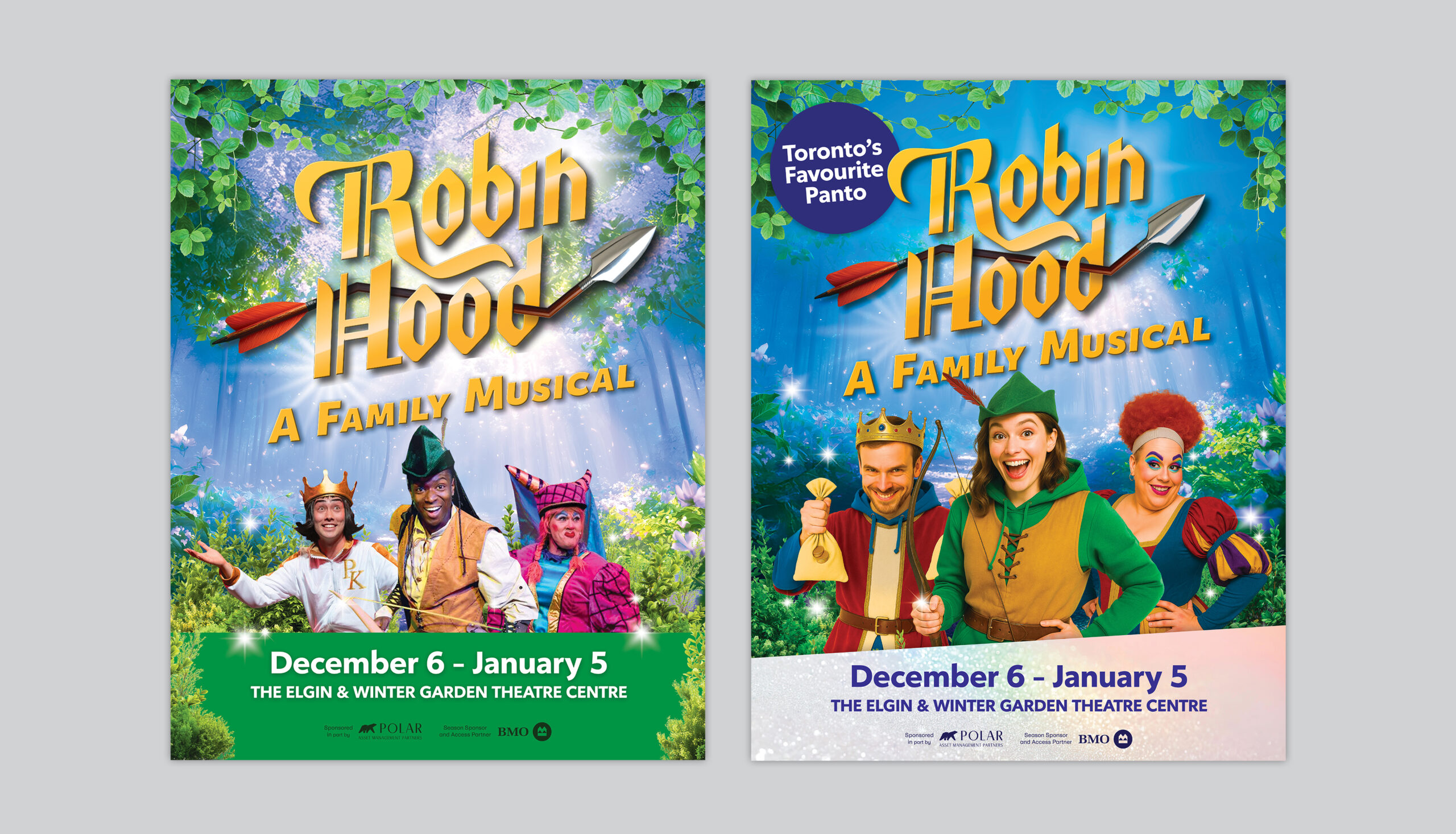
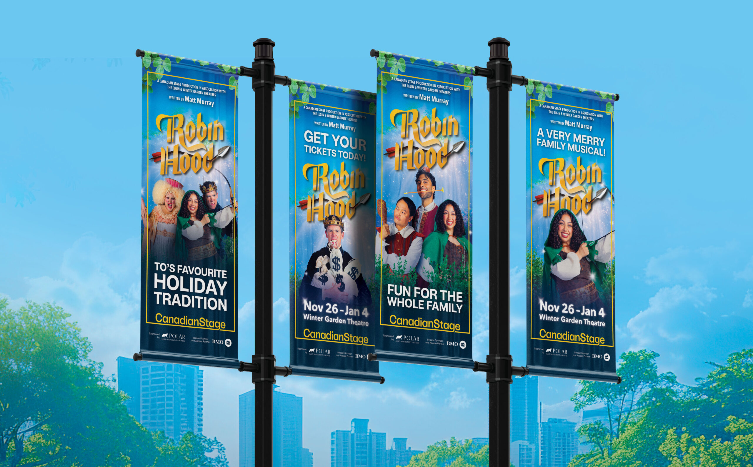
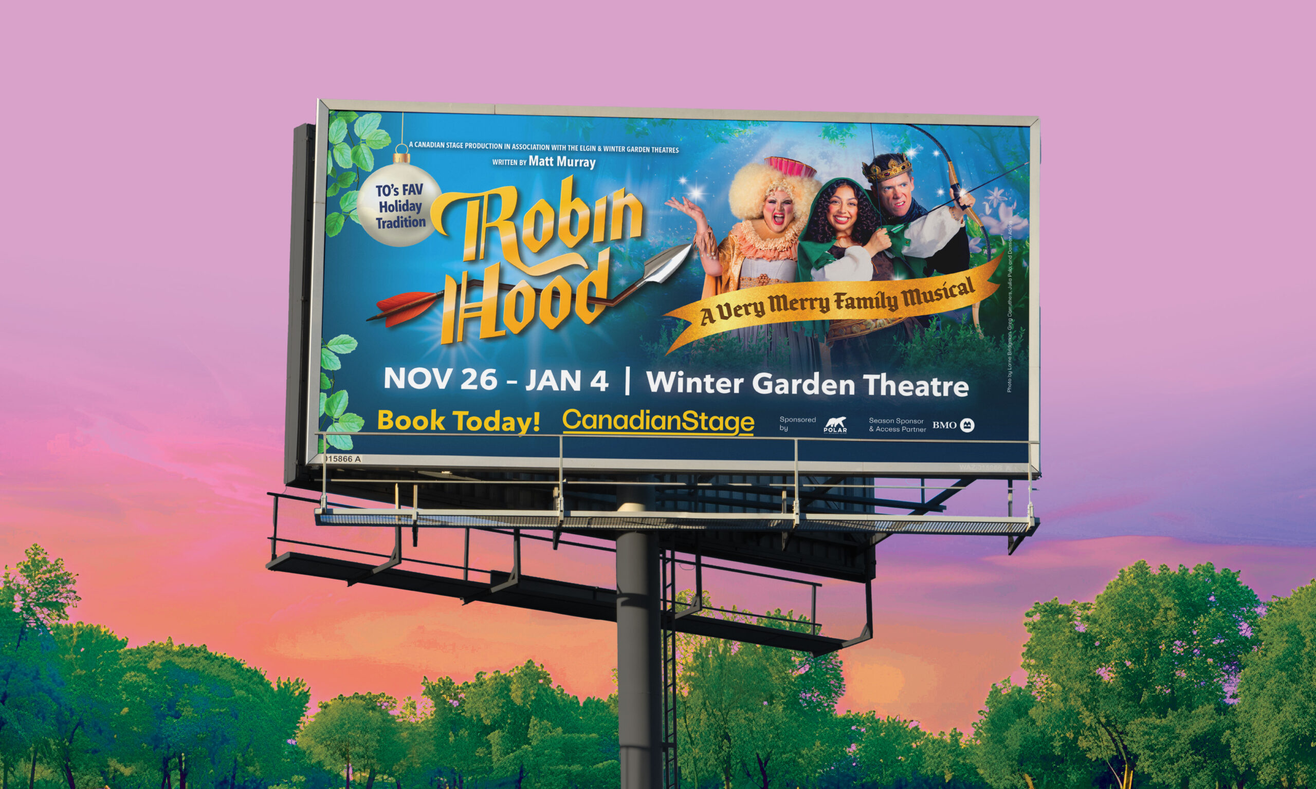
This project marks Canadian Stage’s second year of partnership with Ross Petty. Building on previous season insights, the client requested fewer featured characters, increased use of colour, and an overall tone that leaned more into comedy. Working from an early version of the script, I chose to base the concept around a forest scene, as it would be the easiest to align with a potential future set design. The logo was provided and produced earlier in the year by Richard Stein and integrated into the concept.
The characters are placed front and centre, with exaggerated goofy expressions that immediately establish a playful and comedic tone. A magical forest frames both the characters and the logo, naturally guiding the viewer’s eye back to the main focal points. Beams of light shining through the trees further emphasize and illuminate the logo. While the rich blue background creates strong contrast, allowing the yellow logo to stand out clearly against all other elements.